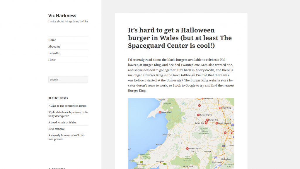
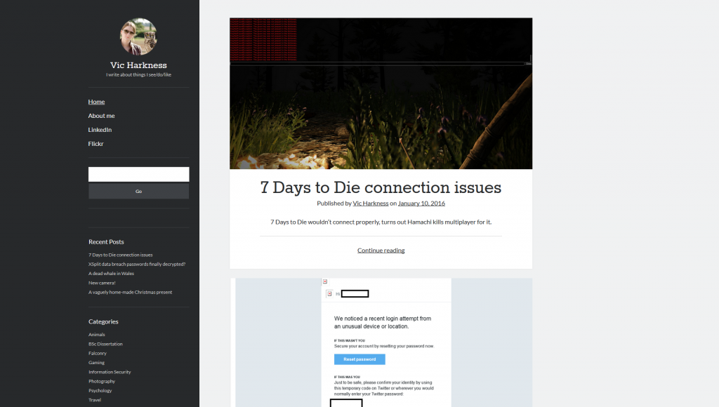
Due to the mammoth sizes of some of my posts, I felt it necessary to re-evaluate the design of my blog. Previously, all posts were displayed in their entirety one after the other on the home page.
As I write about a large variety of subjects, I figured that this would make it harder for people to find the content that they may be interested in. Previously, I was using Twenty Fifteen, one of the default themes. I am now using Author.
This provides previews of posts, which the user can click if they want. It also facilitates an avatar in the top left of the screen, which I have added. It also makes use of excerpt text, and featured images. I have updated my most recent handful of posts so that they will display nicely in this format, but at this time have not bothered with older posts. Perhaps I will one day. Still, I quite like this theme and think that it suits the image-heavy format of my website.


Be First to Comment